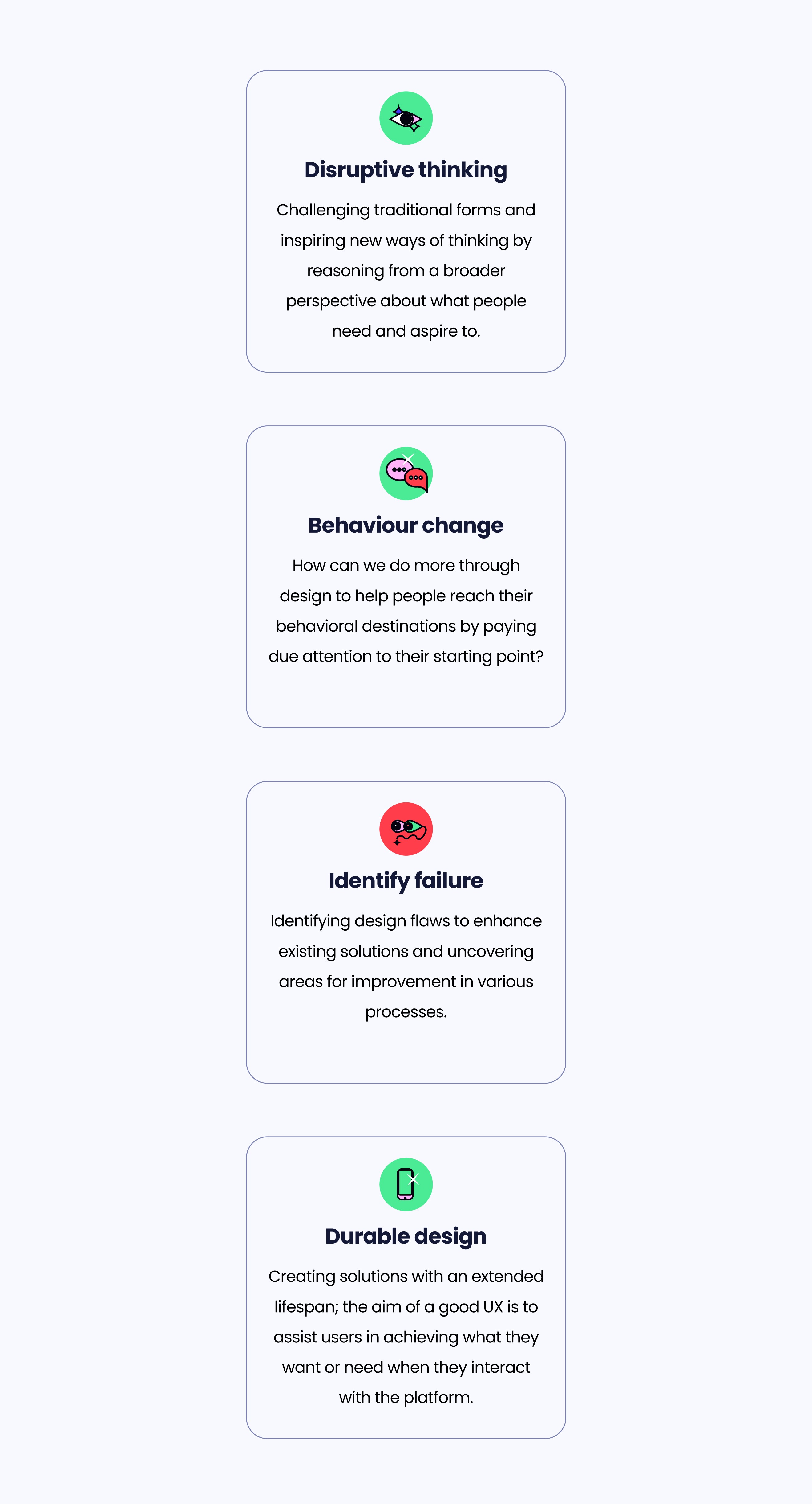
This project was centered around the constant pursuit of innovation and enhancing the customer experience through accessibility within the product. Initially, I crafted a robust design concept, aligning seamlessly with the company's new brand design.
This concept not only embraced the idea of inclusivity but also incorporated the vision of an MVP (Minimum Viable Product) strategically aligned with business KPIs and set goals.
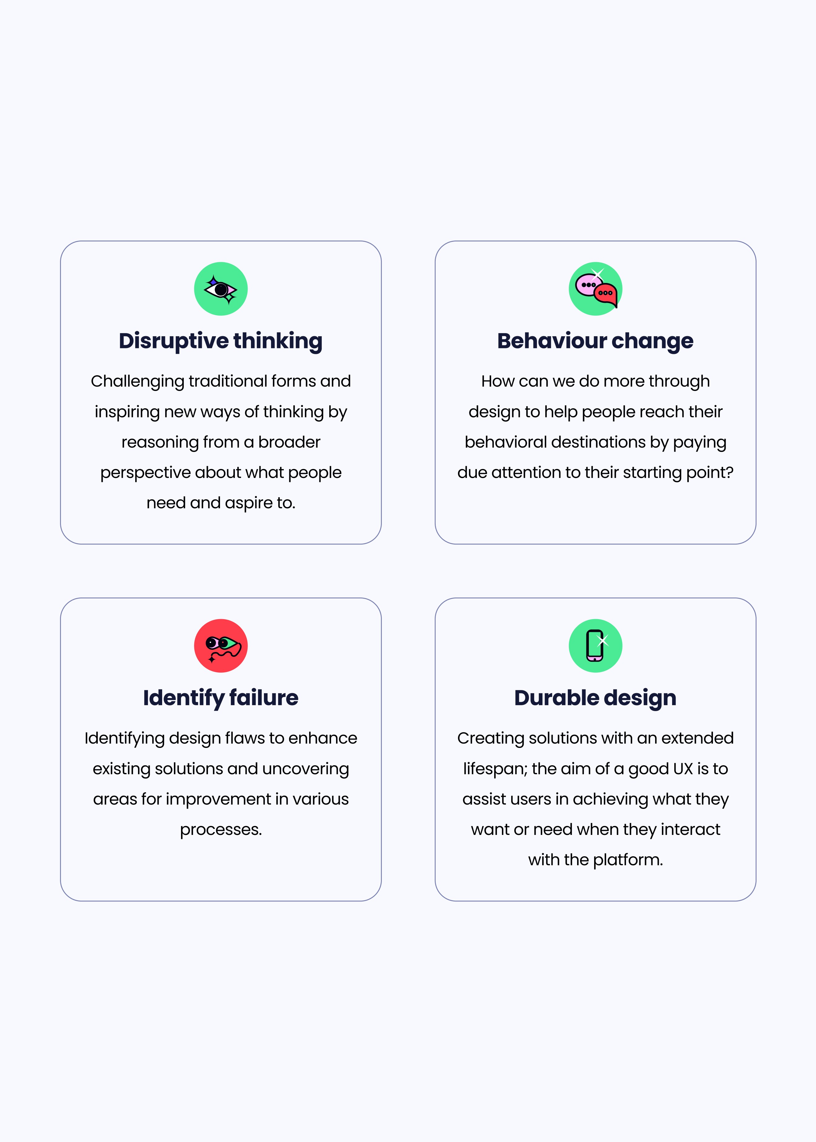
As the Product Designer, I took on a comprehensive end-to-end role, championing a renewed user experience through a platform redesign. My responsibilities extended to creating innovative solutions for existing flows and conducting an in-depth examination of the codebase to identify and prioritize its vulnerabilities. Throughout this journey, I applied the methodology of Design Thinking to guide my approach.
The Challenge


Revitalizing the platform
The redesign and rebranding of the 'Zona Privada' platform to provide a refreshed and consistent user experience across all brand elements, including color schemes, logos, and images.

Spotting Bugs
The project scope includes an extensive bug-sweep and improvement initiative aimed at enhancing the platform's overall performance and ensuring its compatibility with various user accessibility needs.

Content architecture
The project extends to developing a comprehensive user interface that facilitates an intuitive and user-friendly experience, regrouping and reorganizing all its content.

Budget
Budget constraints limited the extent of visual and functional enhancements, necessitating a prioritization of changes based on available resources.

Time
Time constraints mandate that the redesign, rebranding, and bug-fixing efforts must be completed within a specific timeframe to meet business objectives.

Architecture
The project must adhere to existing technology infrastructure, which may impose limitations on certain technical enhancements and require compatibility considerations.
The Users
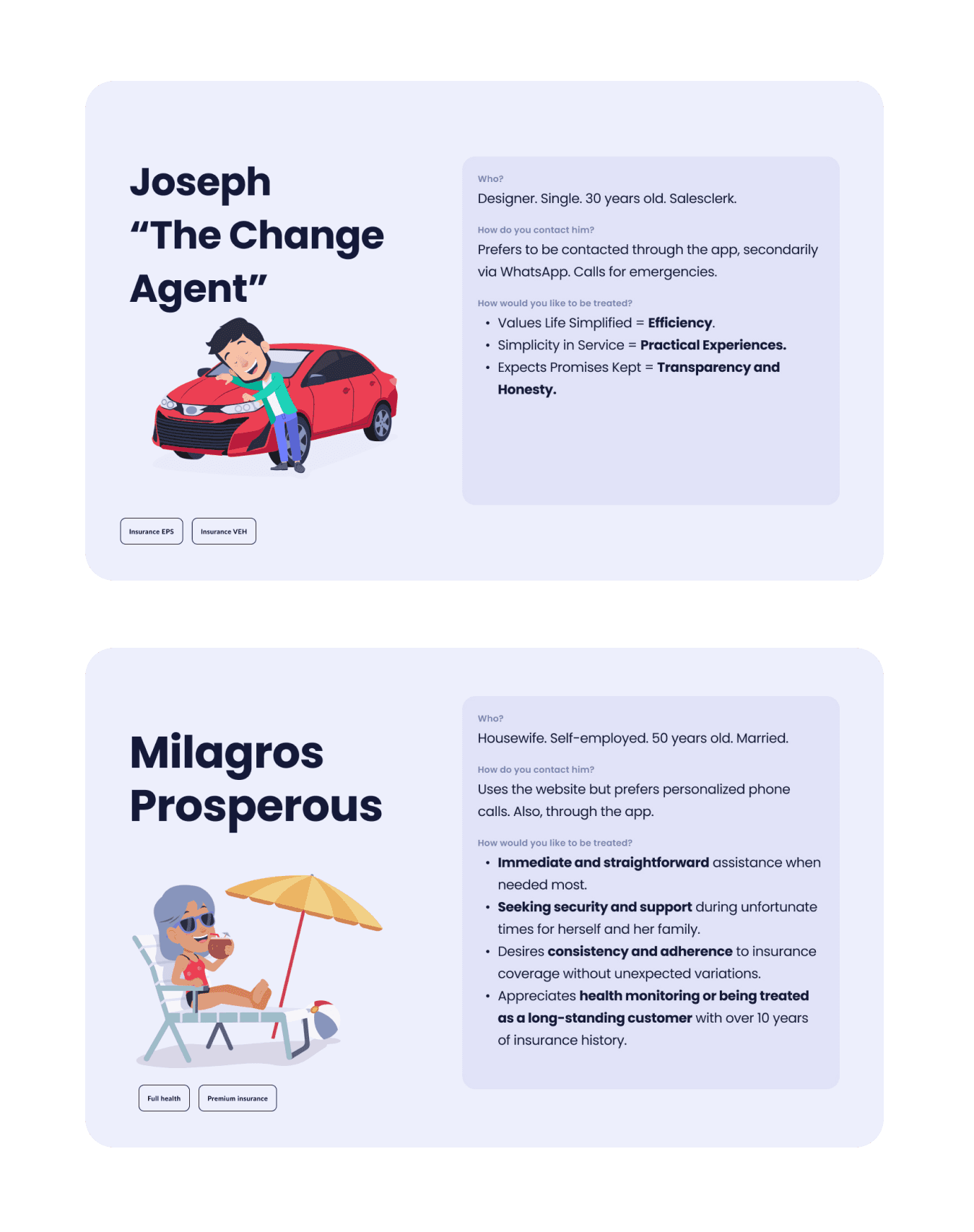
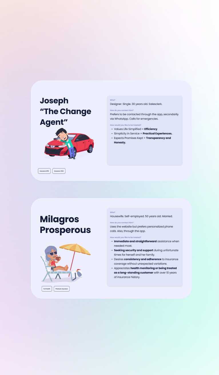
Addressing to diverse user profiles, Rimac's clients serves both a tech-savvy 30-year-old single salesclerk and a 50-year-old married homemaker. The former prefers digital channels like the app and WhatsApp for efficiency, while the latter values personalized phone calls, security, and transparency in insurance services, having been a loyal customer for over a decade."
About The Data
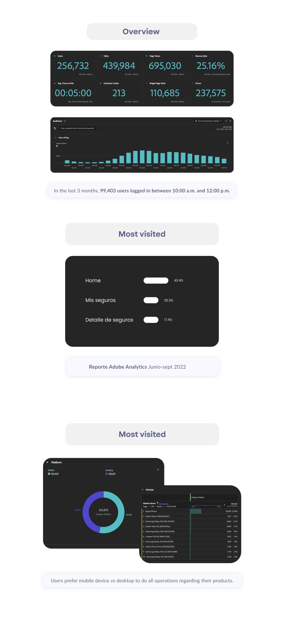
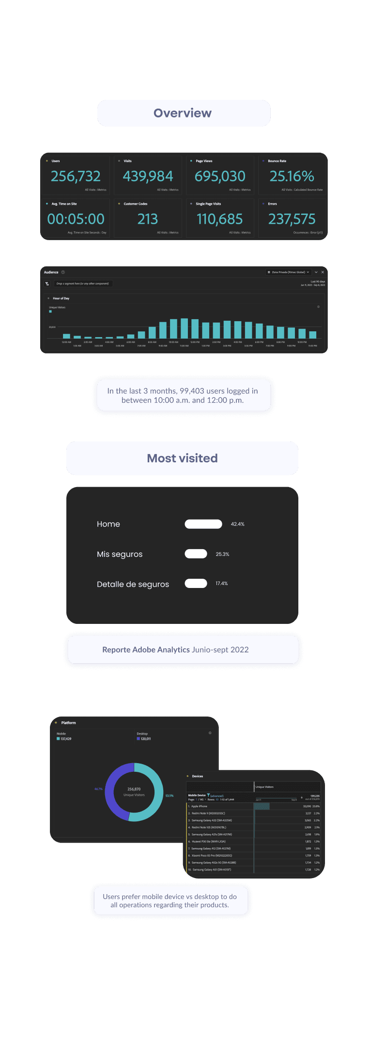
Users primarily access the platform to review their insurance coverages, with a secondary focus on making payments through the platform. They prefer accessing it via their mobile phones and tend to conduct these operations in the morning, users also stay in the Log In flow for a lot of time without doing any action. Understanding these user behaviors is invaluable for making informed decisions in design and prioritization.
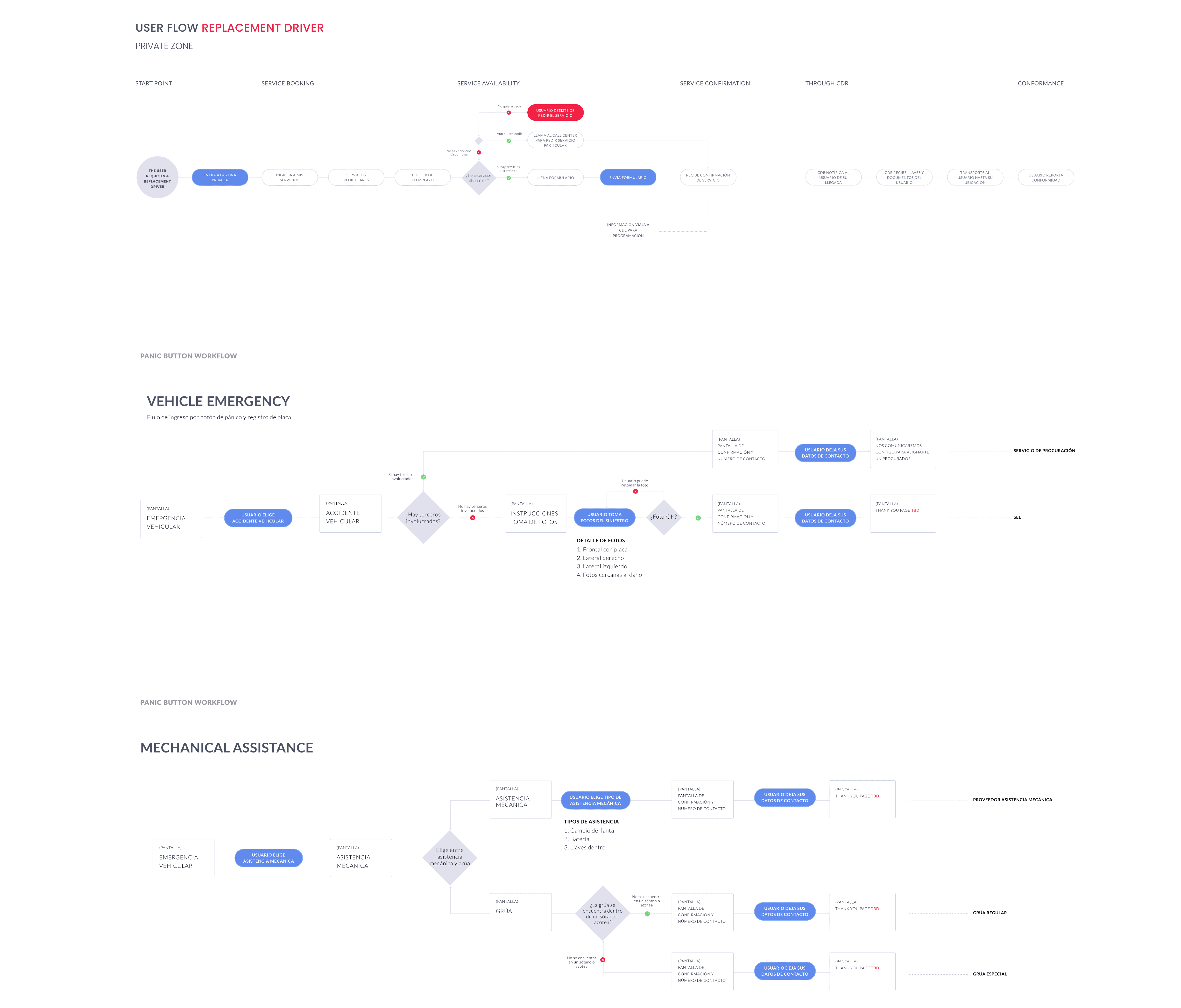
Navigating User Flows
I meticulously charted various user flows for the core app processes and worked closely with my team to perfect the user experience.
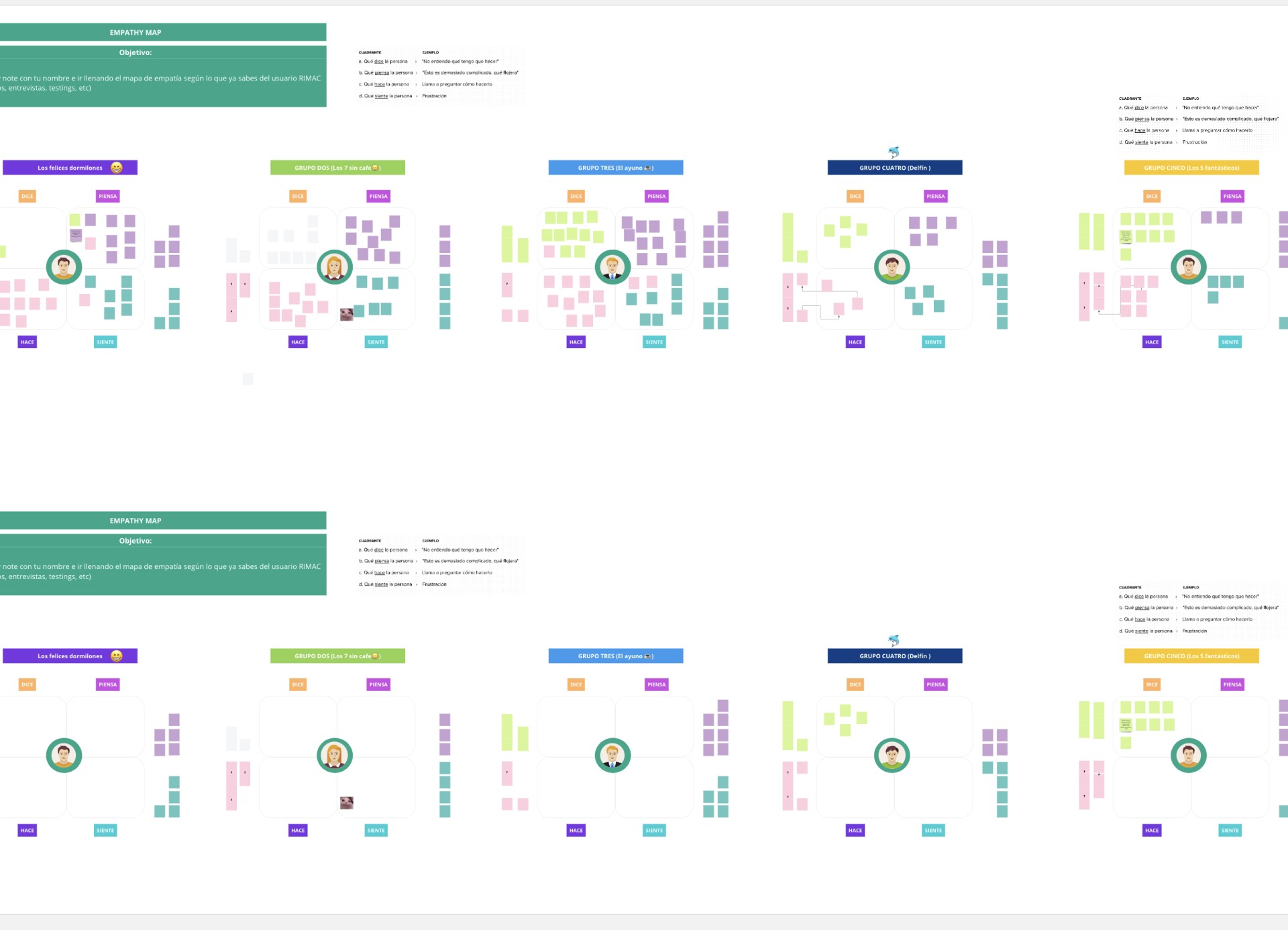
Workshops and interviews were conducted within the Rimac team to gain a deeper understanding of the product and to co-create ideas with various stakeholders.
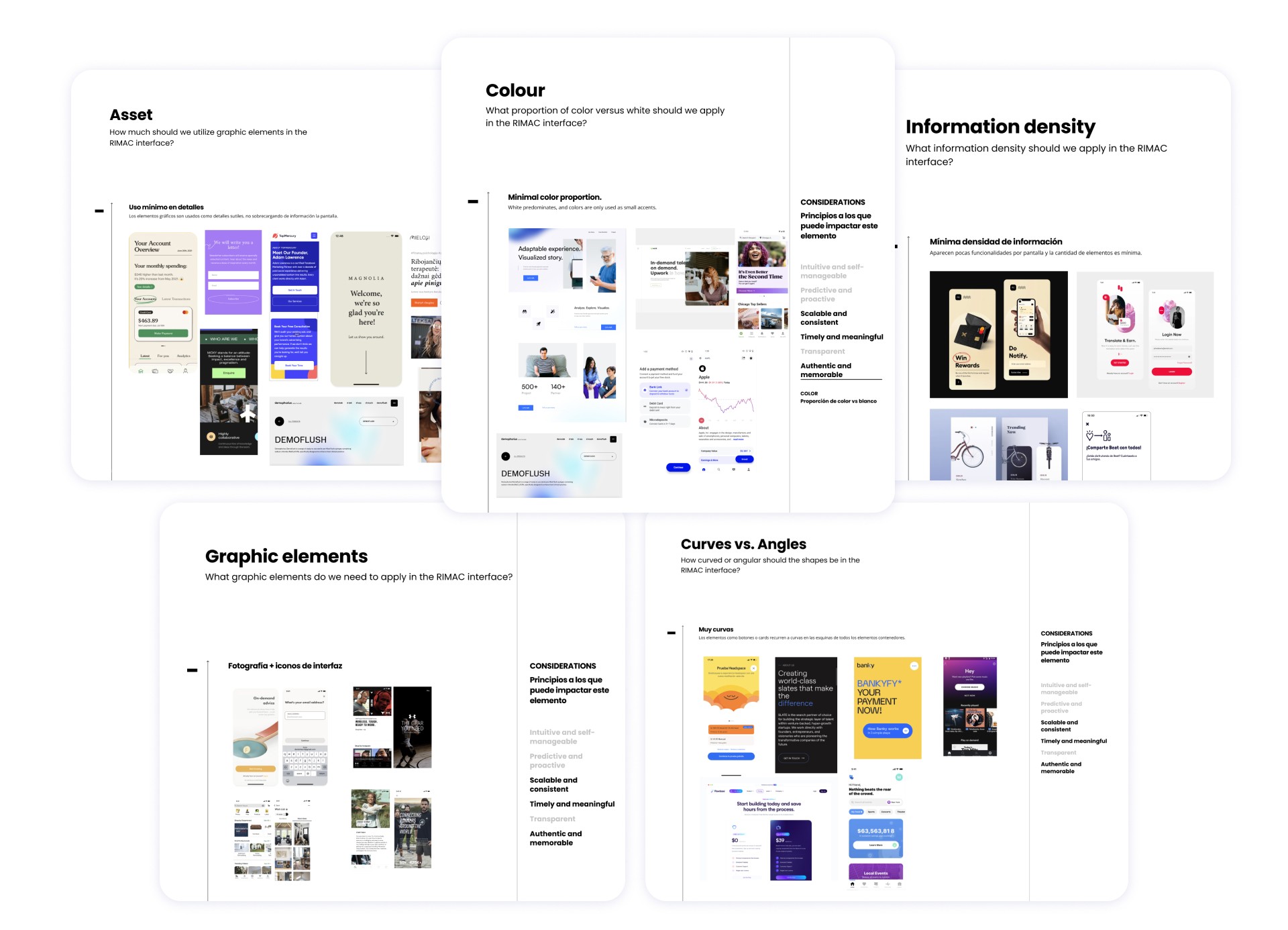
Visual Benchmark
The analysis of elements such as the proportion of color, text contrast, the balance between curves and angles, the utilization of graphic elements, and information density plays a pivotal role in my benchmarking efforts for both content and visual aspects of the platform interface.
Determining the right mix of these elements is critical in shaping a user-centric design that strikes the perfect balance between aesthetics, usability, and content accessibility.
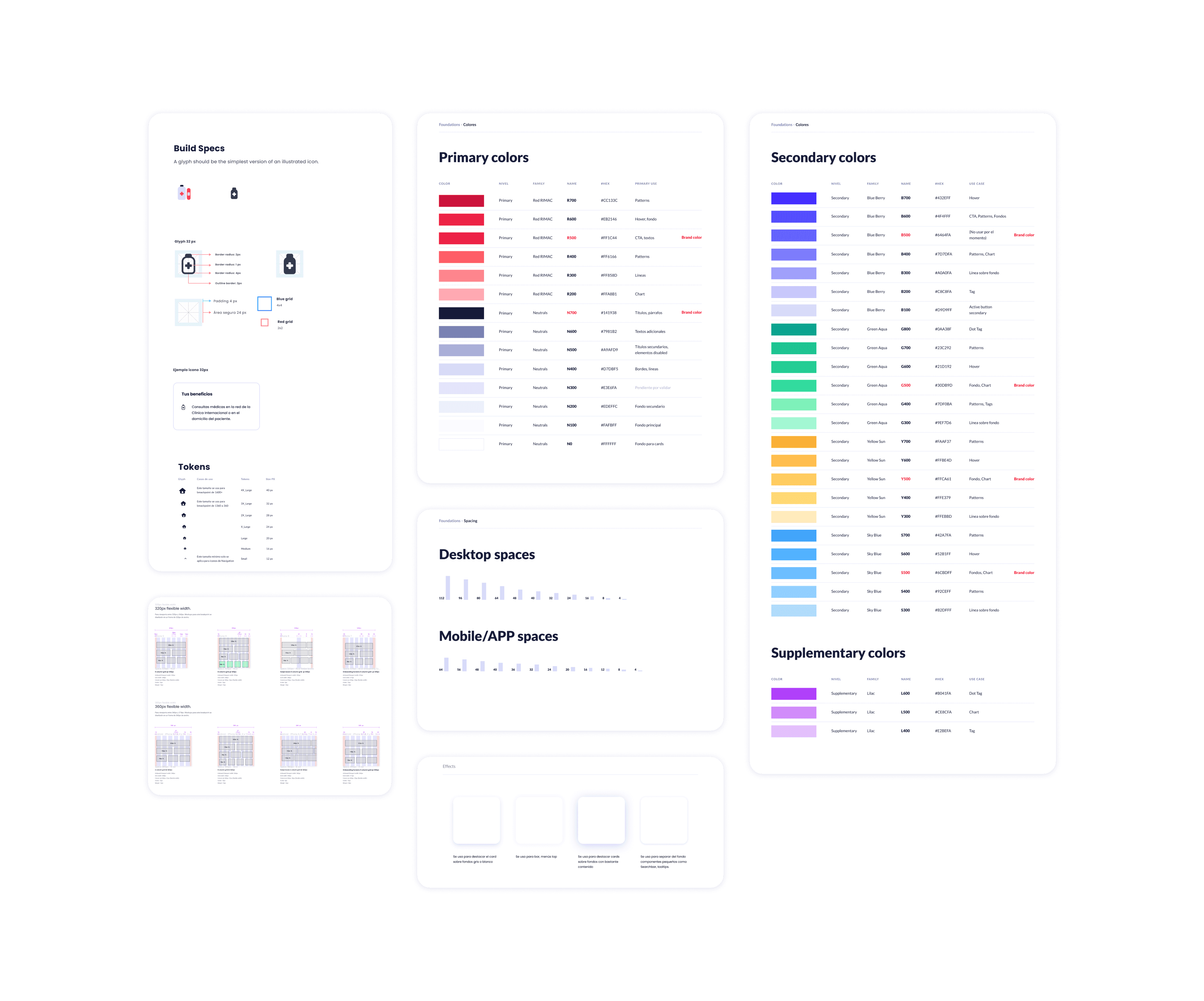
Building The Foundations
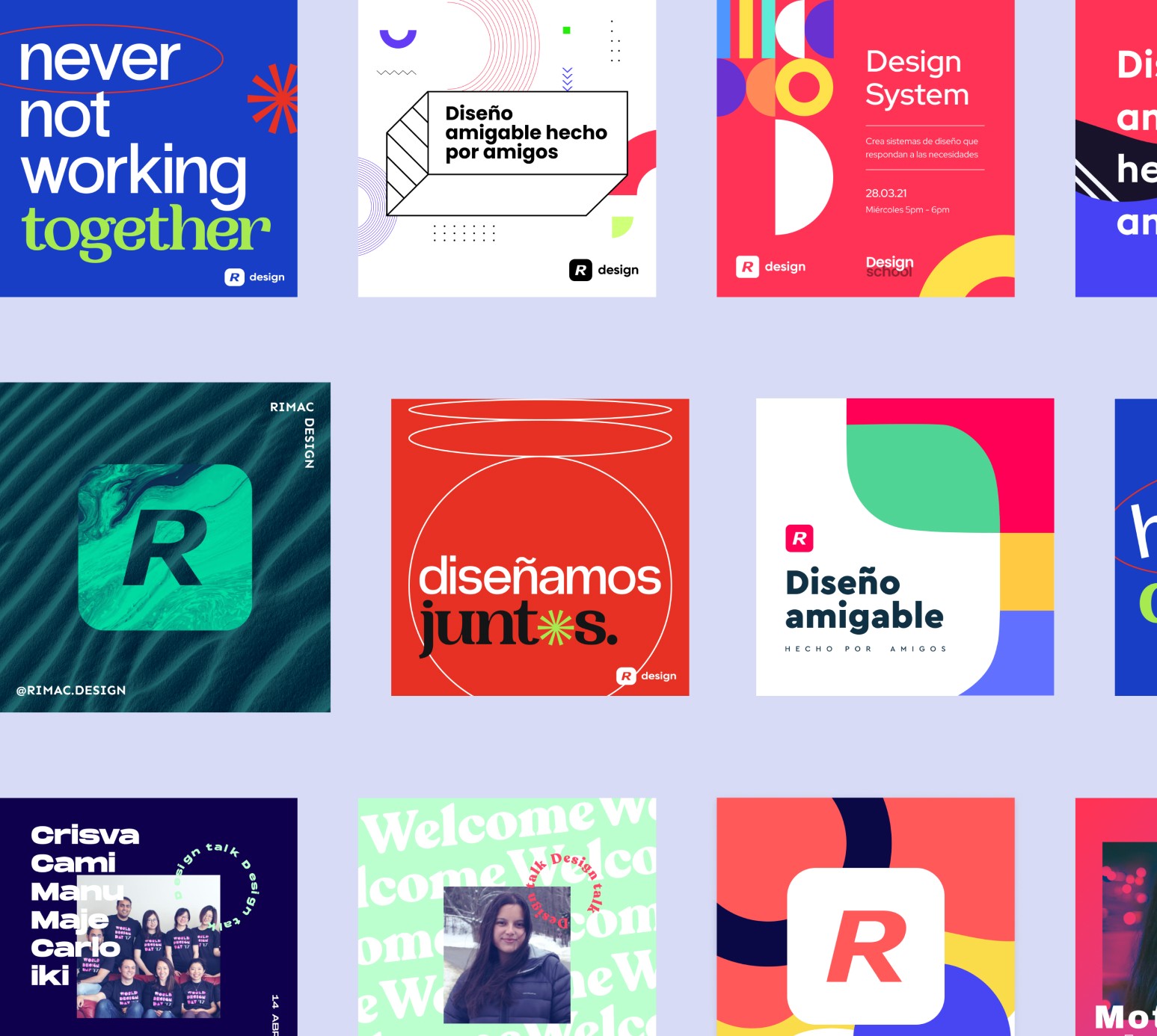
As wireframes gained fidelity, I established a UI kit that helped creating the Design System for Rimac, including visual styles, tokens and UI components. This system increased efficiency during high fidelity design iteration and helped maintain consistency across the platform.
Log in
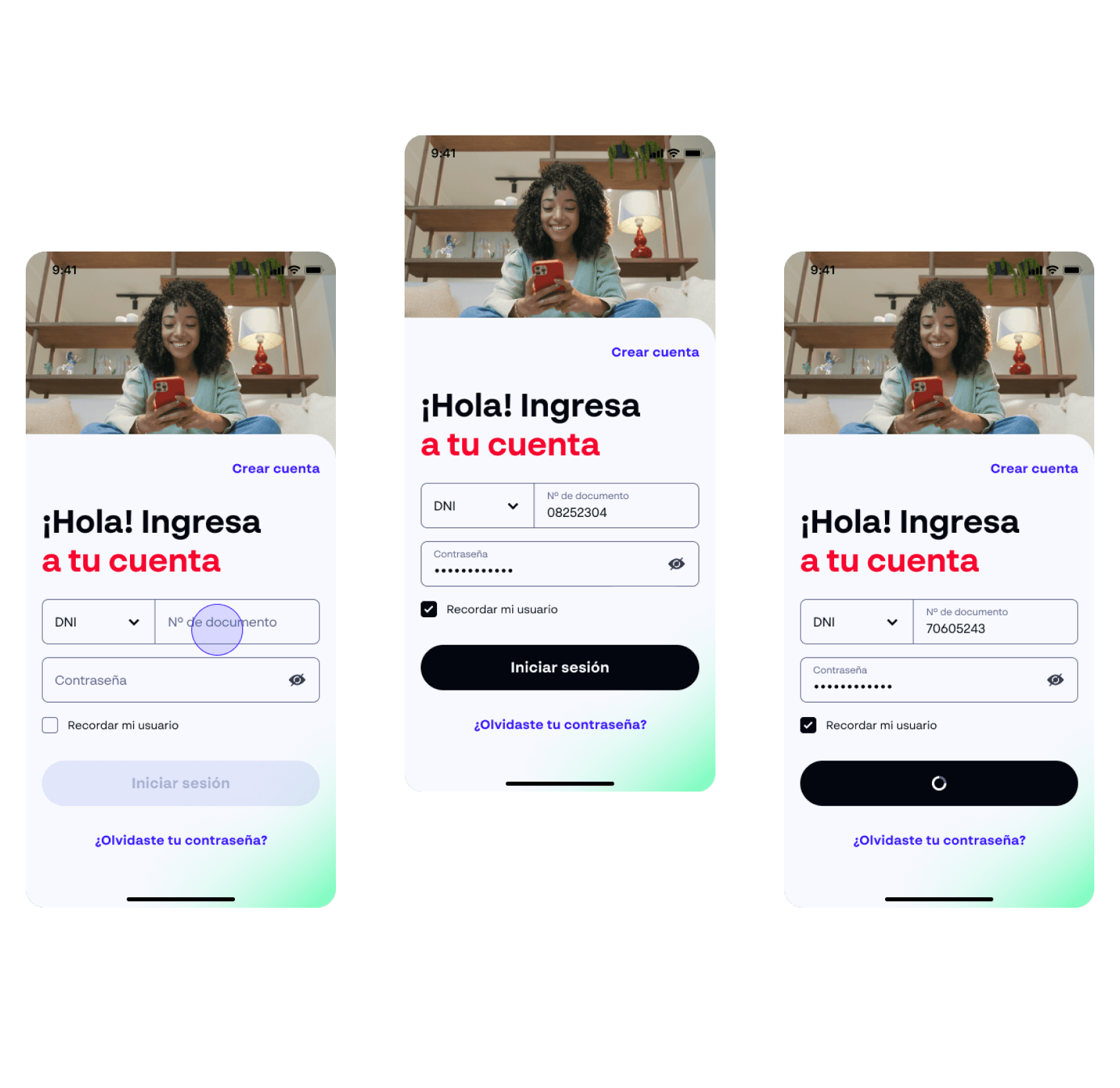
One of the standout achievements was our focus on simplifying the login process. By employing a clean and intuitive user interface, we aimed to ensure that users could access their accounts effortlessly. This approach extended to the registration process as well, creating a harmonious and user-friendly experience right from the first interaction.
Prototype
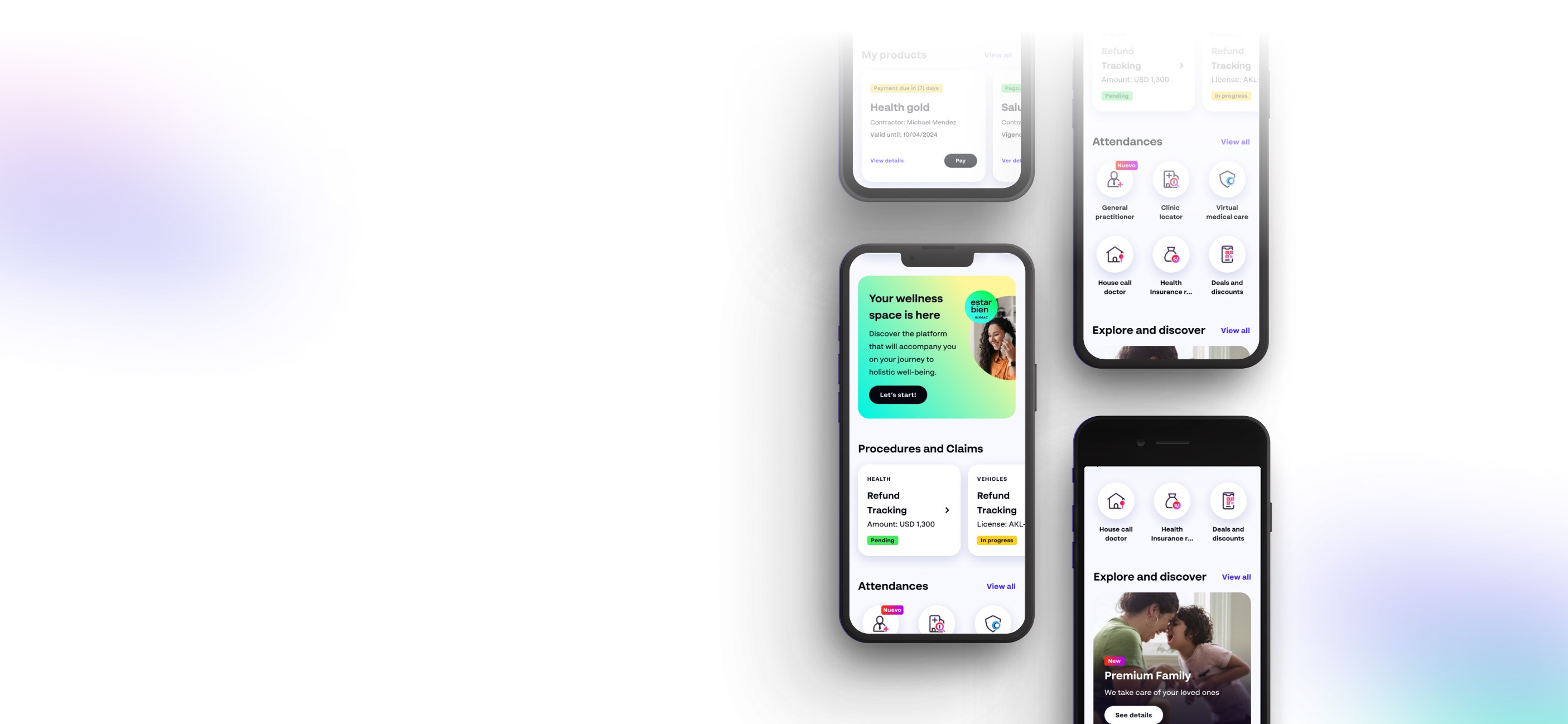
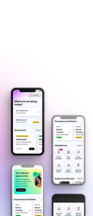
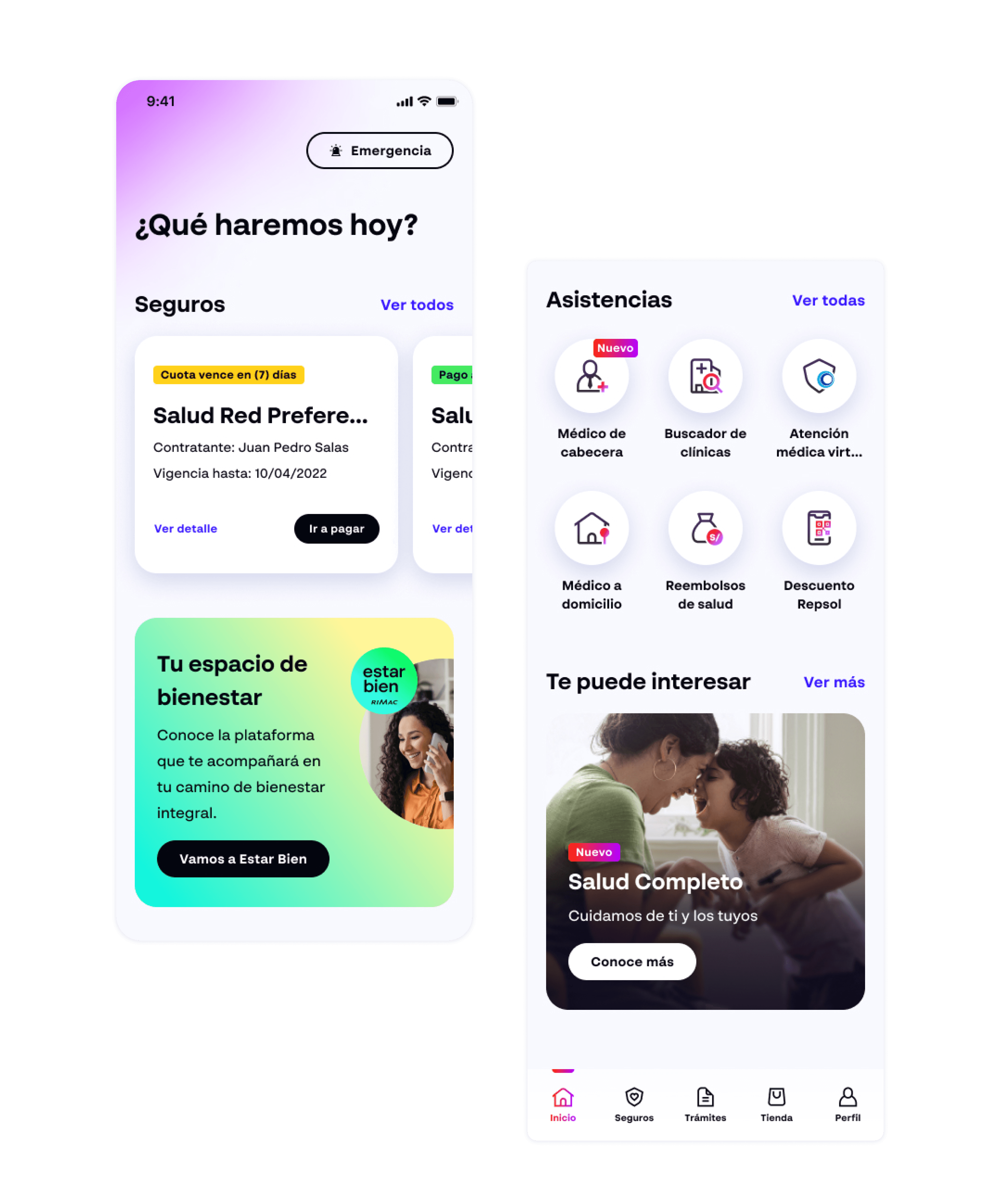
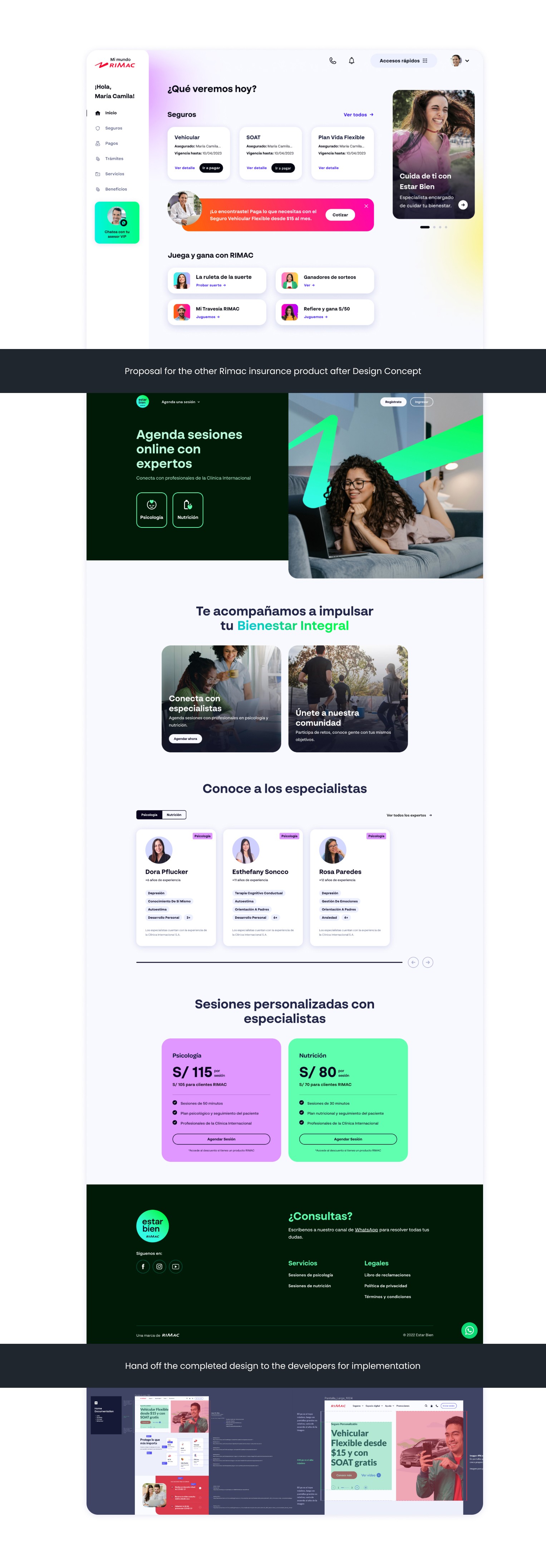
Empowering users through a clear and simple interface, fostering trust, and personalizing experiences with new features and content architecture:
Display ongoing insurance or assistance processes.
Customize reminders for pending payments.
Include shortcuts for essential operations.
Provide "Stay well" reminders for proactive health care.
Aligning with company goals, provide a sales space for relevant insurances or promotions.
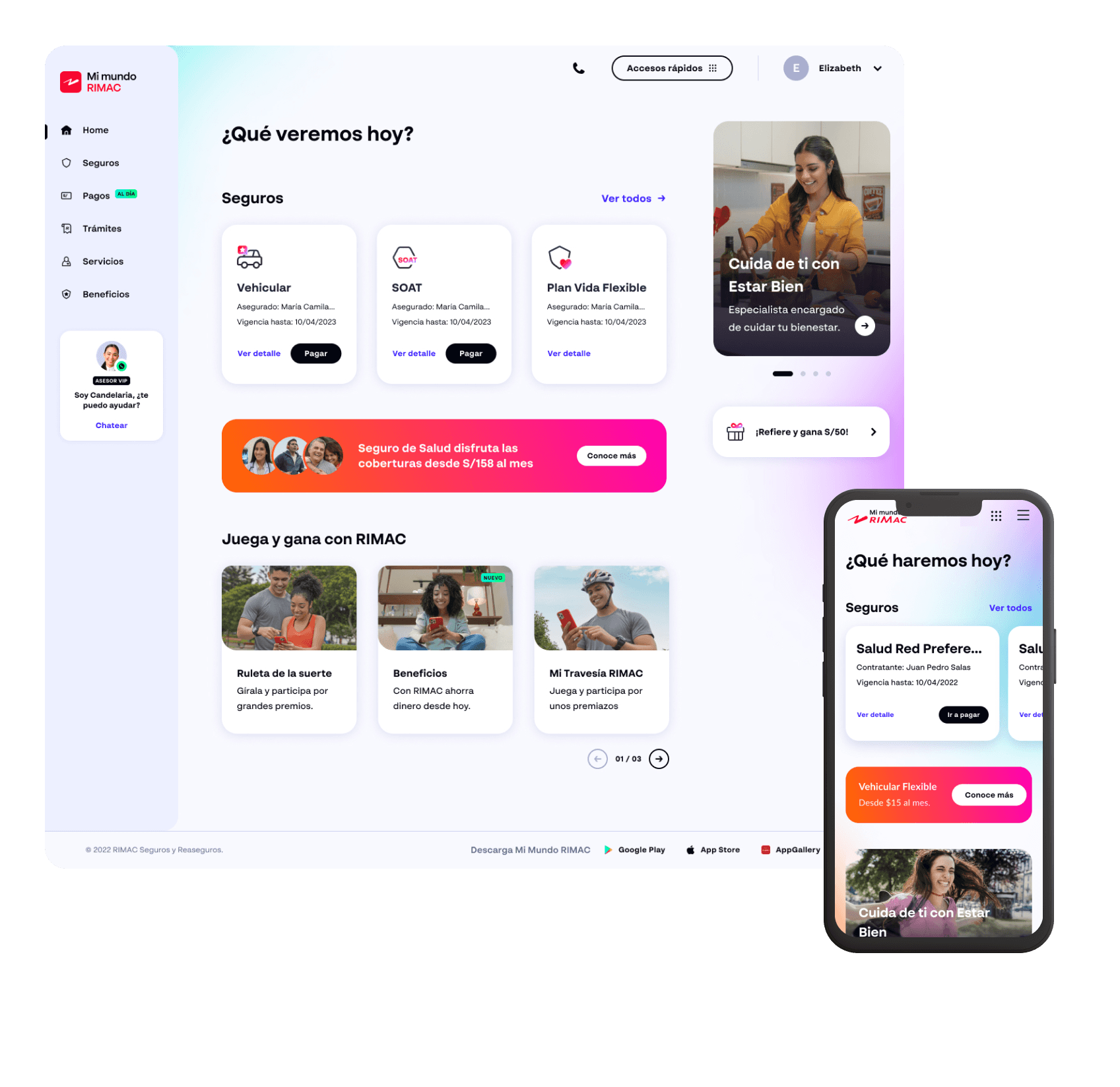
For the private area, I applied the same design principles to create an enhanced design proposal based on the displayed data, always adhering to a 'responsive-first' approach and incorporating an omnichannel experience across all devices.
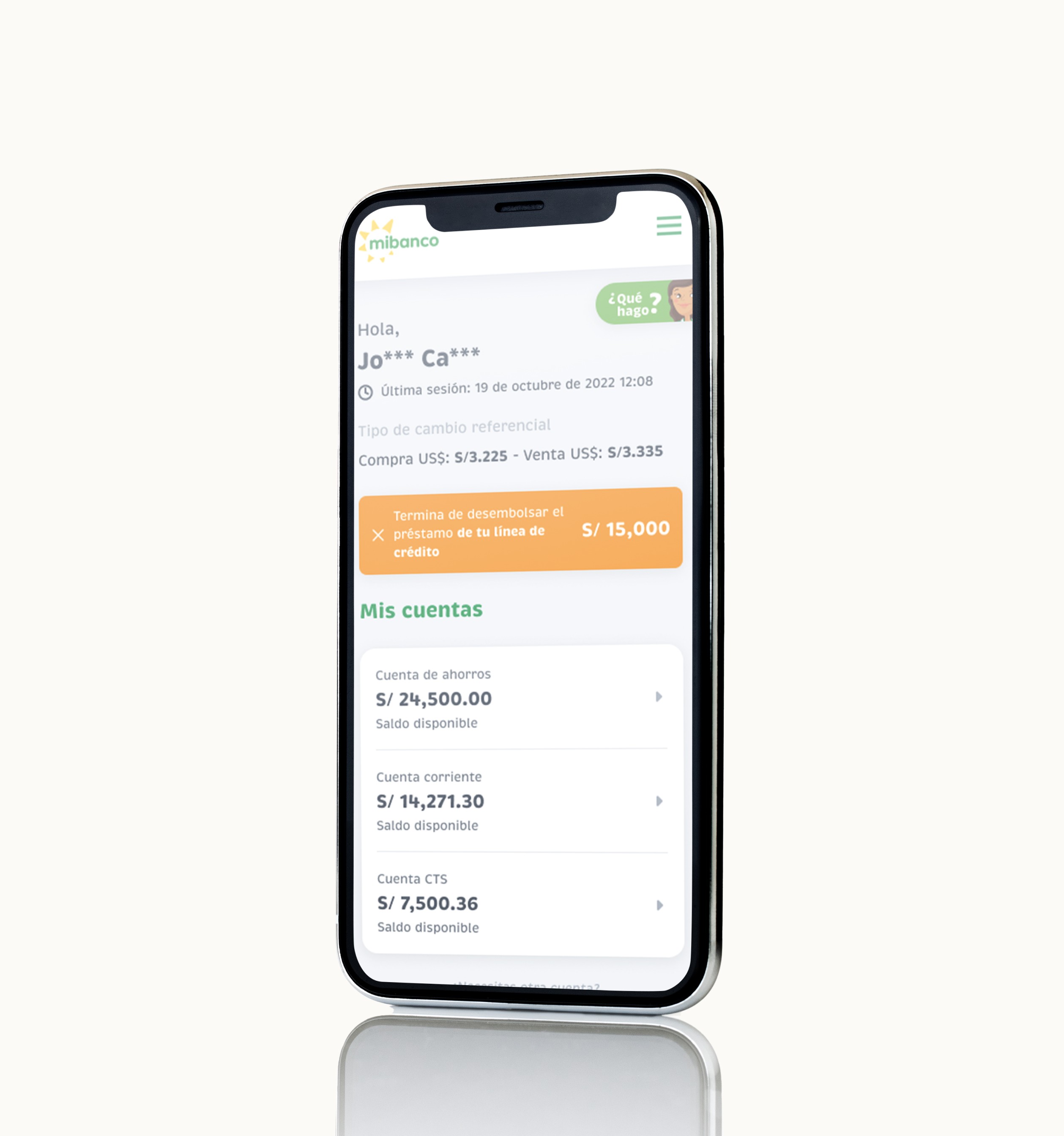
Mibanco Bank
View case study
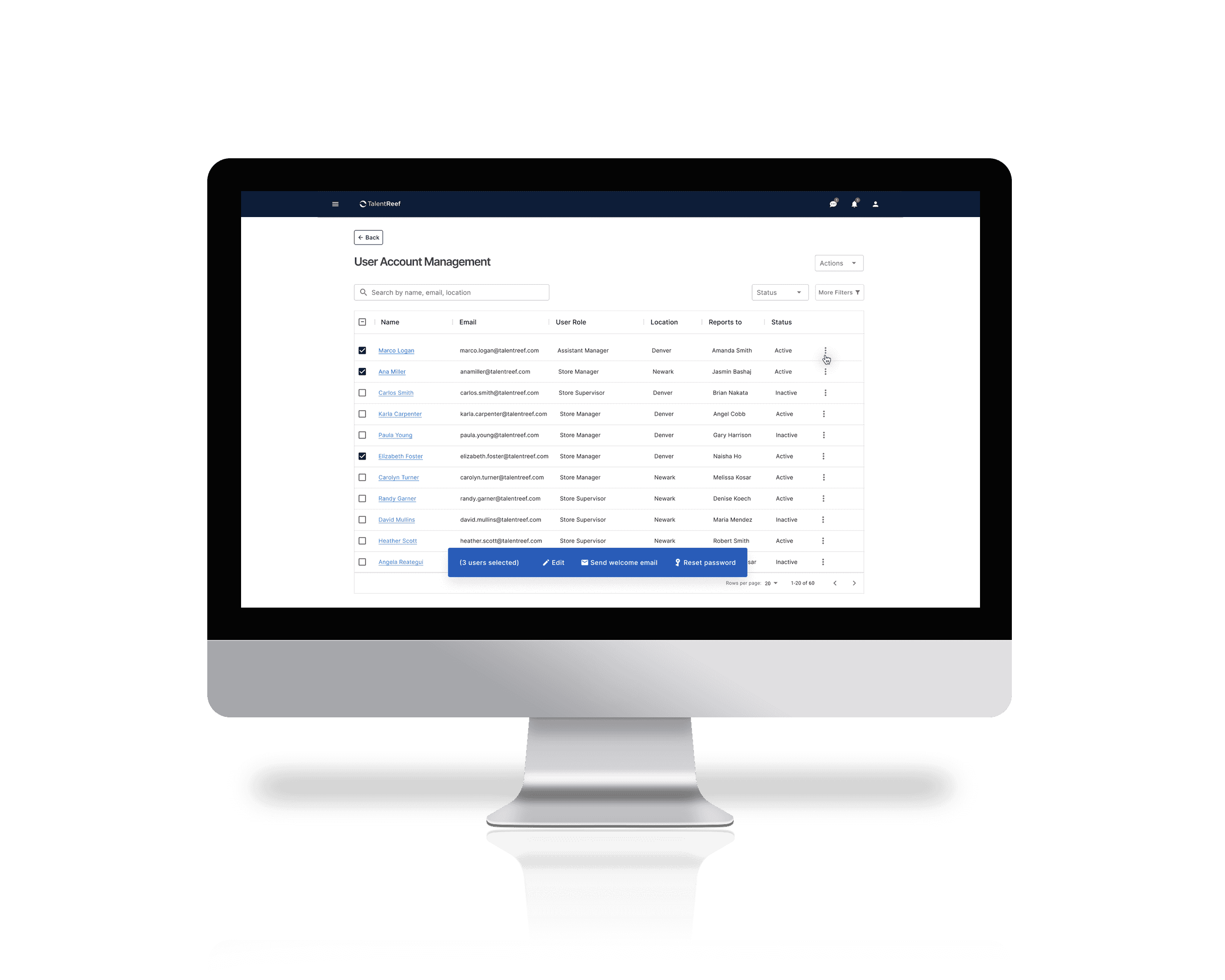
Talent Reef Software
View case study
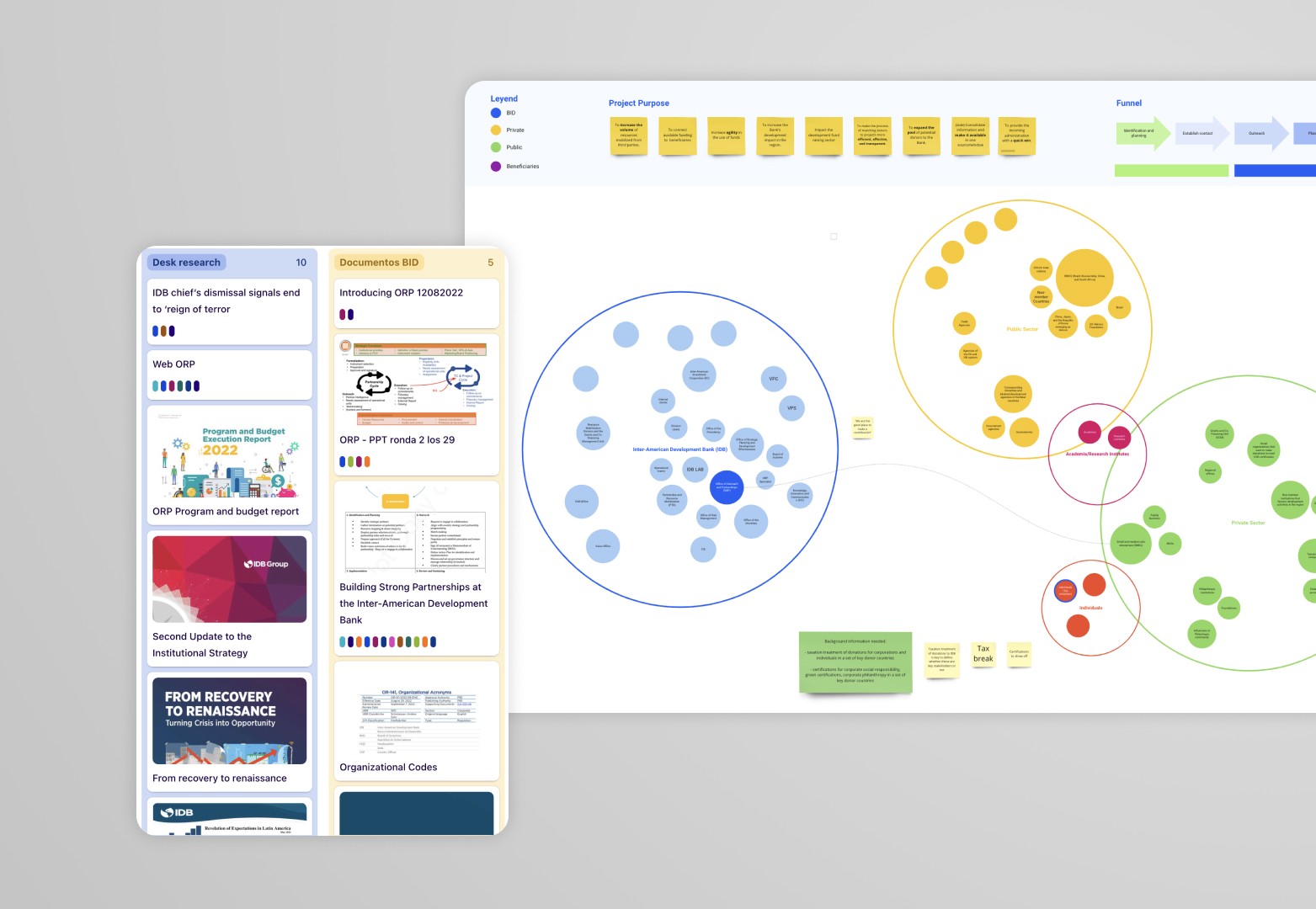
Inter-American Bank
View case study
Designed by Ingrid Valdera using Framer
Last updated November 2023.

